Your Cart is Empty


Choosing paint colors doesn't have to be complicated. The key is to start with three things: your room's lighting, its purpose, and the feeling you want to create. Once you understand how light affects color in your specific space, you can confidently narrow down your options and find a shade you'll love for years to come.
We get it. Standing in front of hundreds of paint chips can feel overwhelming. You might worry about making the wrong choice or wonder if that color you love on the swatch will look completely different on your walls. These are the questions we hear every day atClement's Paint. After nearly four decades of helping Austin homeowners and professionals find their perfect colors, we've learned that there's a straightforward approach that works.
Light is the single biggest factor in how paint colors appear. The same color can look warm and inviting in one room and cold and flat in another. Understanding this will save you from the frustration of painting an entire room only to realize it's not what you expected.
Natural light changes throughout the day, and the direction your windows face matters more than you might think. A south-facing room gets warm, direct sunlight for most of the day. This bright light can make colors appear lighter and warmer. North-facing rooms receive cooler, more consistent light that can make the same paint color look slightly blue or gray. East-facing rooms get warm morning light and cooler afternoon shadows, while west-facing rooms experience the opposite.
This is exactly why a paint color can look completely different on different walls in the same room. The wall that catches direct sunlight will show the color differently from a wall that stays in shadow most of the day. It's not a flaw in the paint. It's just how light and color interact.
Artificial lighting adds another layer to consider. Warm-toned bulbs (often labeled "soft white") will push colors toward yellow and orange. Cool white or daylight bulbs bring out blues and greens. If you're painting a room where you spend most of your time in the evening under artificial light, that's the lighting condition you should prioritize when testing colors.
The practical takeaway? Always test your paint colors in the actual room where they'll live. Look at them at different times of day. What reads as a perfect greige at noon might lean purple under your living room lamps at night. This simple step prevents a lot of disappointment.

Every room serves a different purpose, and yourcolor choices should reflect that. Here's how to think about the main spaces in your home.
This is often the heart of the home, and typically the first space guests see. Many homeowners gravitate toward neutral colors here because they create versatility. A well-chosen neutral provides a backdrop that works with changing furniture, art, and seasonal decor. That said, your living room is also a great place for a bold accent wall if you want to create a focal point. Consider what mood you want: calm and relaxing, or energized and social? Your wall color sets that tone.
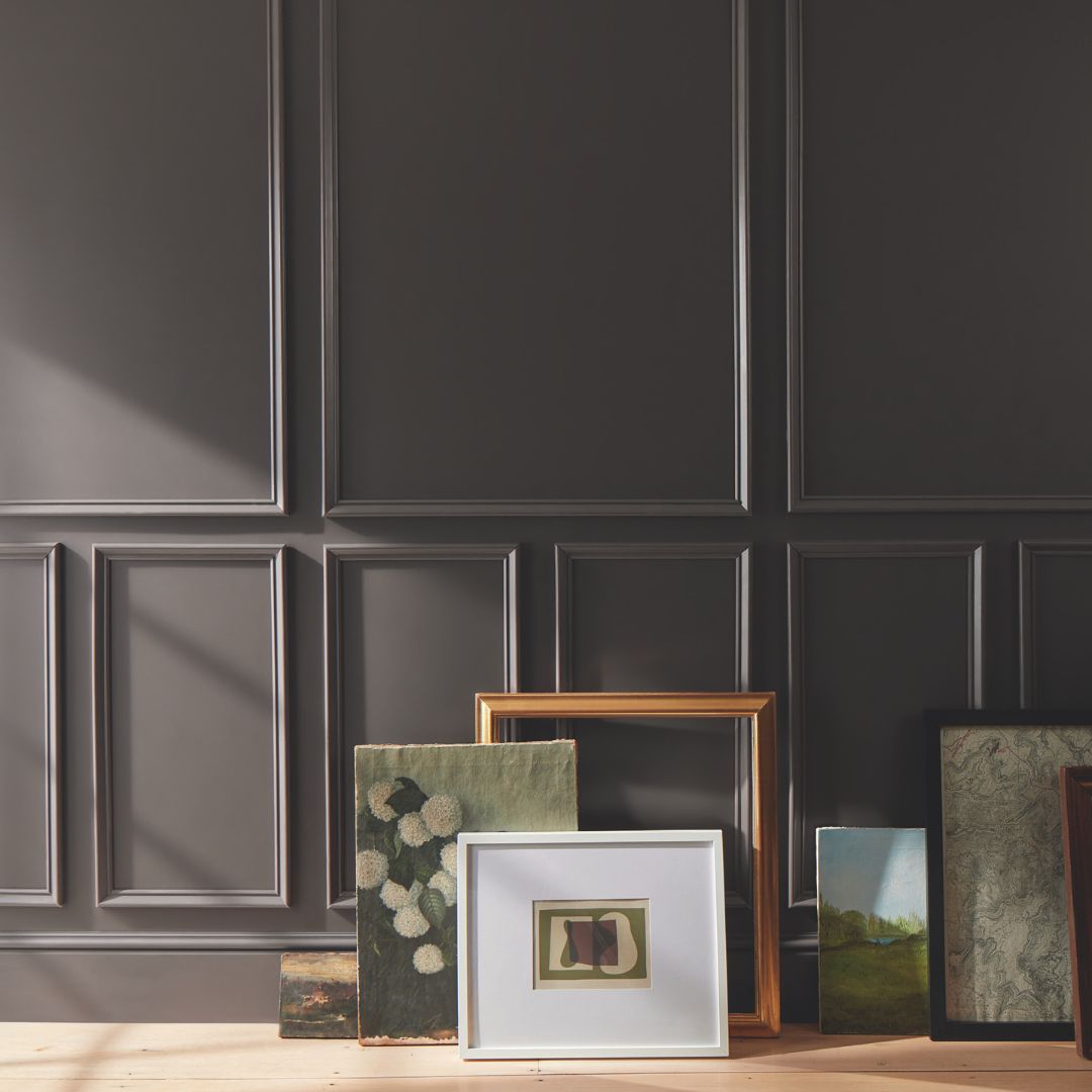
Because dining rooms are used for shorter periods, they're an excellent place to experiment with richer, more dramatic colors. Deep blues, warm terracottas, or sophisticated greens can create an intimate atmosphere that feels special for meals and gatherings. Don't be afraid to go bolder here than you might elsewhere.
Your kitchen cabinets, countertops, and backsplash should guide your wall color. In smaller kitchens, lighter colors can make the space feel more open. If you have a lot of wood tones in your cabinetry, consider how warm or cool your paint color is and whether it complements or clashes with those existing elements.
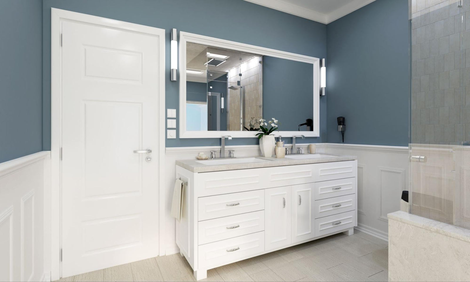
Personal preference matters most here. This is your private retreat, so choose colors that make you feel comfortable. Soft, muted tones tend to promote relaxation and better sleep, but there's no rule against a fun, vibrant color if that's what speaks to you. Kids' rooms can handle playful colors that might feel too intense elsewhere.
Think about how rooms connect visually. You don't need to paint every room the same color, but having a cohesive color palette helps your home feel intentional. One approach is to choose three to five colors that work together and distribute them thoughtfully. Your living room neutral might appear in a lighter shade in the hallway, while a bolder version of an accent color shows up in the dining room.

Here's the truth: paint samples cost a few dollars, but repainting an entire room costs time, money, and frustration. Testing is not optional if you want to get this right.
Colors look different on screens and under store lighting than they will in your home. Even the most experienced interior designers and professional painters test before committing to a color. It's not a sign of indecision. It's just smart.
When you test, paint a large enough area to really see the color. A small dab won't give you accurate information. Aim for at least a 12x12 inch square, and paint it in two coats to see the true color depth. Test on multiple walls if your room has varied lighting. Look at your samples in the morning, afternoon, and evening under both natural and artificial light.
Before you even get to sampling, a fan deck or collection of paint swatches can help you narrow your options. The color wheel is useful for understanding relationships between colors. Complementary colors (opposite each other on the wheel) create energy and contrast. Analogous colors (next to each other) feel harmonious and calm. Knowing this helps you build a color scheme that works.
If you're nervous about committing to a bold color for an entire room, an accent wall is a lower-risk way to introduce something different. Paint one wall in your more adventurous choice while keeping the others in a complementary neutral. This lets you enjoy that color you love without feeling overwhelmed.
One more tip: look at your paint sample next to your existing furniture, flooring, and any fixed elements like tile or countertops. A color that looks perfect in isolation might clash with what's already in the room. Everything needs to work together.

There's a reason homeowners, designers, and contractors throughout Central Texas have trustedClement's Paint since 1986. The experience you get at a dedicated local paint store is simply different.
Our staff can help you understand how different paint sheens affect your color's appearance. They can guide you through the process of matching an inspiration piece you brought from home. They'll ask questions about your lighting, your existing decor, and how you use the space so they can point you in the right direction.
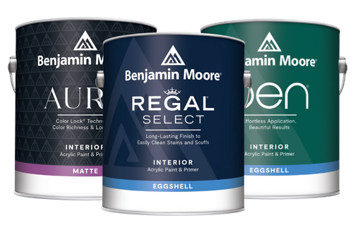
As Austin's oldest Benjamin Moore dealer, we carry a paint brand known for its quality, color accuracy, and coverage. That matters because even the most beautiful color won't look right if the paint itself doesn't perform well. Good paint means better coverage, truer color, and a finish that lasts.
If you’d like more help choosing colors, we can connect you with design professionals who offercolor consulting services. Sometimes it helps to have an expert look at your space, consider all the variables, and make informed recommendations. It's not about telling you what to like. It's about helping you clarify what you already want and making sure your final selection will deliver.
At the end of the day, choosing paint colors should be enjoyable. It's a chance to put your personal stamp on your home. If you're feeling stuck or just want a second opinion, stop by any of our Austin-area locations. Bring your paint chips, your fabric samples, or even just your questions. We're here to help you find the colors that feel right.