Your Cart is Empty


Picking a new paint color is one of the most exciting parts of any home project. It’s also one of the decisions people agonize over the most. With a new year comes a fresh wave of color trends, and 2026 is delivering some truly inspiring options.
So what’s trending right now? This year’s top wall colors lean heavily into warm earthy tones, nature-inspired greens, moody blues, rich jewel tones, and softer, warmer neutrals. The era of stark white walls and cool grays is fading. In its place, homeowners are reaching for paint colors with real warmth, personality, and depth. These are colors that make a home feel grounded and lived-in, not staged.
Let’s get into the 10 trending wall colors defining homes this year and how to put them to work in your space.

1. Sandy Beige / Warm Khaki
Say goodbye to cool gray. The new go-to neutral is awarm, sandy beige that feels organic and effortless. Think sun-baked linen or worn canvas. This shade works beautifully in a living room, bedroom, or as a whole-house color palette. It plays well with just about everything, from natural wood furniture to bold accent colors.
2. Soft, Warm Off-Whites
White walls aren’t going anywhere, but they are getting warmer. The crisp, almost clinical whites of the past few years are being replaced bybuttery ivories and soft creams. These shades still brighten a room, but they add a layer of warmth that makes a space feel more inviting. They’re a perfect choice for rooms with plenty of natural light, where that warm undertone really comes alive.
3. Mocha Mousse and Warm Browns
Rich, warm browns gained serious momentum after Pantone selected Mocha Mousse as its 2025 Color of the Year, and thisearthy tone has carried right into 2026. It adds instant sophistication to bedrooms, dining rooms, and home offices. Pair it with natural materials like wood, leather, and linen for a layered, collected look.
4. Sage Green and Soft Greens
Sage green continues to be one of the most popular paint colors on the market, and it’s easy to see why. This nature-inspired hue brings calm into any room without feeling overpowering. It works as a grounding wall color in living rooms and bedrooms, and it looks stunning alongside complementary shades of warm white trim and natural wood tones.
5. Deep Olive and Muddy Greens
For a richer, moodier take on the green trend, deep olives and mossy forest tones are having a major moment. These shades add drama and depth, especially in a living room or dining room. Designers love pairing them with brass accents and warm textiles. Benjamin Moore’sGloucester Sage is a favorite worth sampling.
6. Moody Blues
Blues are shifting. The icy, cool-toned blues of recent years are giving way to warmer, smokier versions with violet or gray undertones. Thesemoody blues create cozy, enveloping spaces that feel like a retreat. They’re ideal for bedrooms, reading nooks, and accent walls where you want a room to feel a little more wrapped-in and personal.
7. Deep Burgundy and Warm Mahogany
This bold hue is making a real comeback.Deep burgundy and warm mahogany shades bring a warm, rich color that instantly warms up a room. This color works well as an accent wall or across an entire room for a dramatic jewel-box effect. Try it with creamy whites and olive greens for balance.
8. Jewel Tones
For homeowners ready to make a statement, jewel tones like deep plum, emerald, and sapphire deliver richness and personality in a big way. These bold hues reflect the 2026 move toward layered, collected interiors. They work best as an accent color or in smaller spaces like powder rooms and dining rooms, where a little goes a long way.
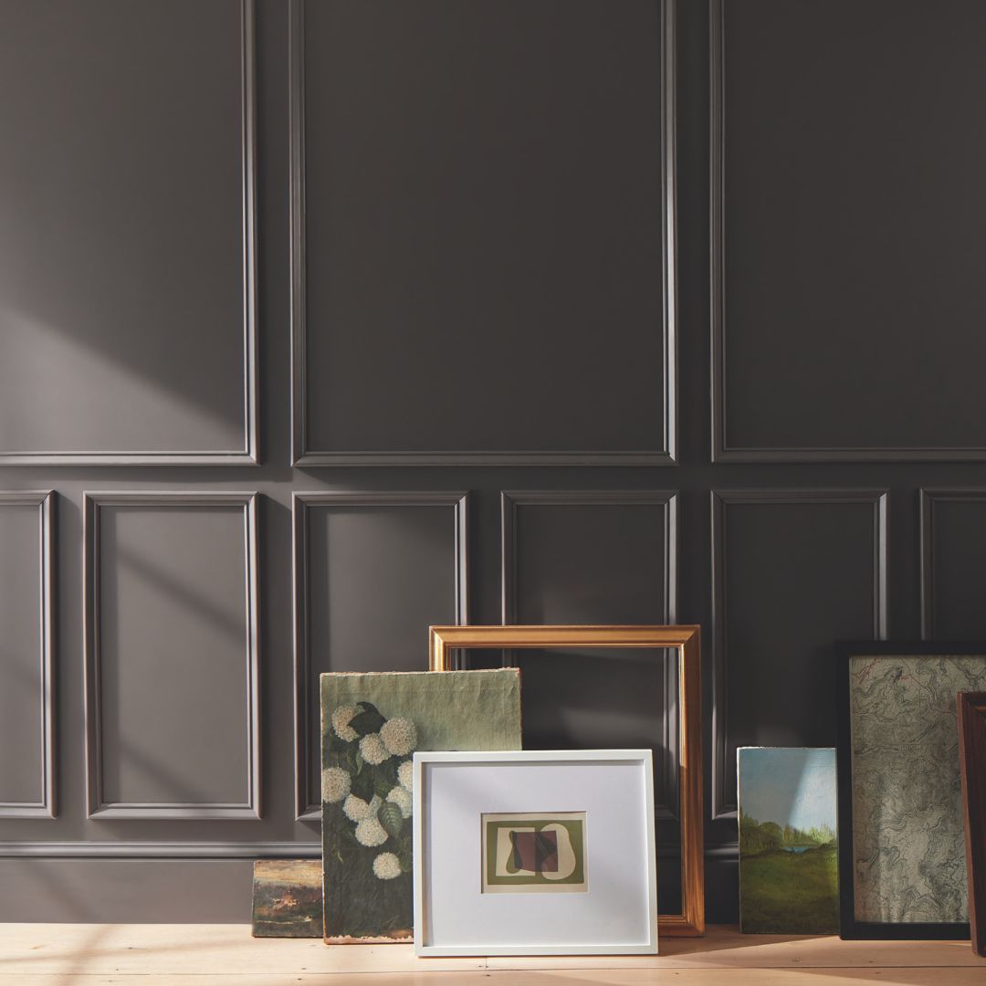
9. Silhouette by Benjamin Moore (2026 Color of the Year)
Benjamin Moore’s2026 Color of the Year is Silhouette, a refined espresso-charcoal with beautiful depth. This timeless hue anchors their entire 2026 color palette. It pairs naturally with soft whites, muted greens, and warm terra cottas. Use it on an accent wall, kitchen cabinetry, or trim for a grounding effect that feels both modern and classic.
10. Warm Putty and Taupe
Sitting right between beige and gray, putty tones offer something that cooler neutrals never quite could: depth with warmth. These shades feel timeless rather than trendy. They create a sophisticated, tactile foundation for any color palette and work beautifully across walls, trim, and ceilings when you want a seamless, pulled-together look.

Finding a trending color you love is the fun part. Making sure it actually looks great in your home takes a little more thought. Here are a few things worth considering before you commit.
Pay attention to your lighting.Natural light changes everything. A paint color that looks perfect in a south-facing room full of sunshine can look completely different in a north-facing space. Artificial lighting matters too. Warm bulbs push colors warmer, while cool LEDs can make the same shade feel flat. Always test your top picks in the actual room, at different times of day, especially during the times of day you’ll spend the most time in that room.
Start with an accent wall.If a bold hue or deep shade feels like a big commitment, an accent wall is a smart way to test the waters and ground an otherwise adventurous color choice. It brings the color into your space without overwhelming it, and it’s an easier weekend project as a DIYer than a full room repaint.
Think about flow.When building a color palette for your home, think about how colors move from room to room. Complementary shades and a cohesive palette create harmony. You don’t need every room to match, but they should feel like they belong together.
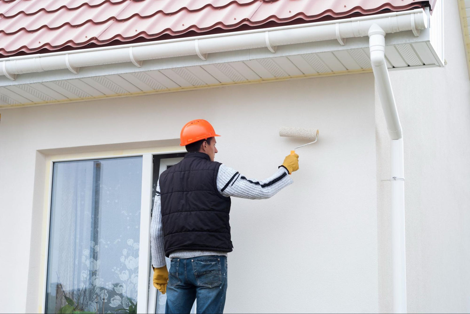
Don’t forget the exterior.Many of these paint color trends translate beautifully outside. Warm khakis, sage greens, and deep charcoals are just as striking on a home exterior as they are inside. If you’ve been considering a refresh for yourexterior paint color, this year’s earthy palette has plenty to offer.
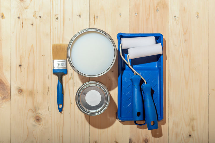
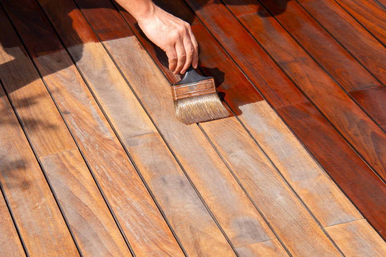
Sample before you commit.This is the single best piece of advice for choosing any paint color.Grab a sample, brush it on the wall, and live with it for a day or two. You’ll be glad you did.
If you’re noticing a theme here, you’re right. The biggest paint trend of 2026 is warmth. Homeowners are moving away from the cool, minimal look that dominated for the past decade and reaching for colors that feel more personal, more natural, and more grounding.
There’s a growing desire for spaces that feel connected to the natural world. That’s why nature-inspired hues pulled from clay, stone, moss, and earth keep showing up across every major brand’s trend forecast. AnnualColor of the Year announcements all reflect this shift. The color marketing conversation in 2026 is clearly centered on comfort, warmth, and character.
People want their homes to tell a story. These colors help make that happen.

Choosing the right paint color is a lot easier when you’ve got someone in your corner who knows color inside and out. That’s what the team at Clement’s Paint has been doing since 1986.
As Austin’s oldest Benjamin Moore dealer, we can tint our premium products to any hue ofBenjamin Moore’s 2026 Color Trends palette, including Silhouette and every shade in the collection, as well as countless others. But more than just high-quality products, we offer something you won’t find at a big-box store: real, personalized advice from people who live and breathe paint every single day. Our job is to make your project a success.
Stop by one of ourAustin or Marble Falls locations to explore samples, talk through your project, or we can connect you with design professionals who offercolor consulting services. From your first coat of primer to the final brushstroke, we’re here to help you get it right and love the result.